grid布局
grid 布局,又称为网格布局。
采用 grid 布局的元素,我们称为 grid 容器,简称“容器”。它的直接子元素则称为 grid 项目,简称"项目"。
grid 布局是二维布局,它有“行”和“列”的概念,形成一个个的网格,项目占据多少个网格,占据哪些位置的网格都可以由我们定义。
容器的属性
display
通过display: grid或display: inline-grid可以将指定元素变为网格容器,该元素的所有直系子元素将成为网格项目。
其中,display: grid表示该容器是一个块级元素,display: inline-grid表示该容器是一个行级元素。
element {
display: grid;
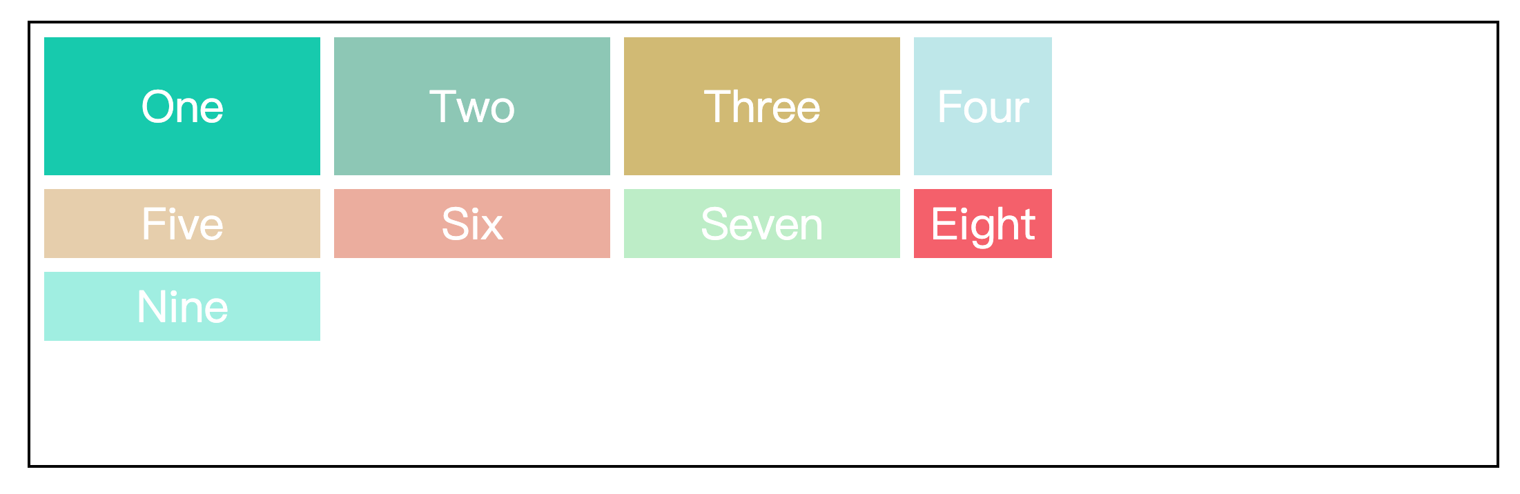
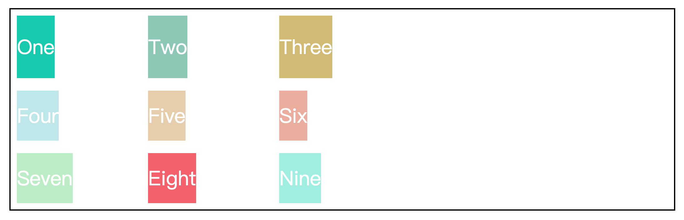
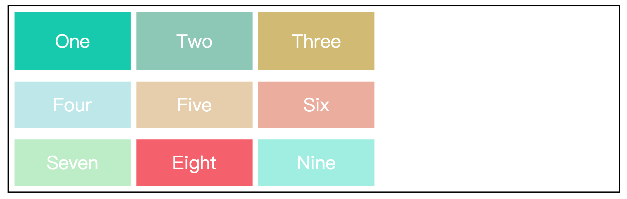
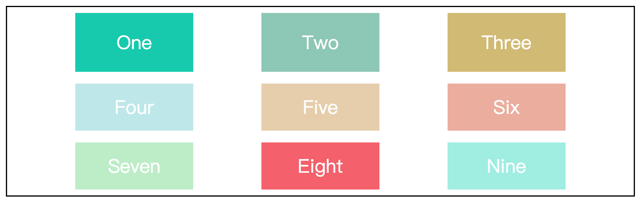
}grid-template-columns 属性和 grid-template-rows属性
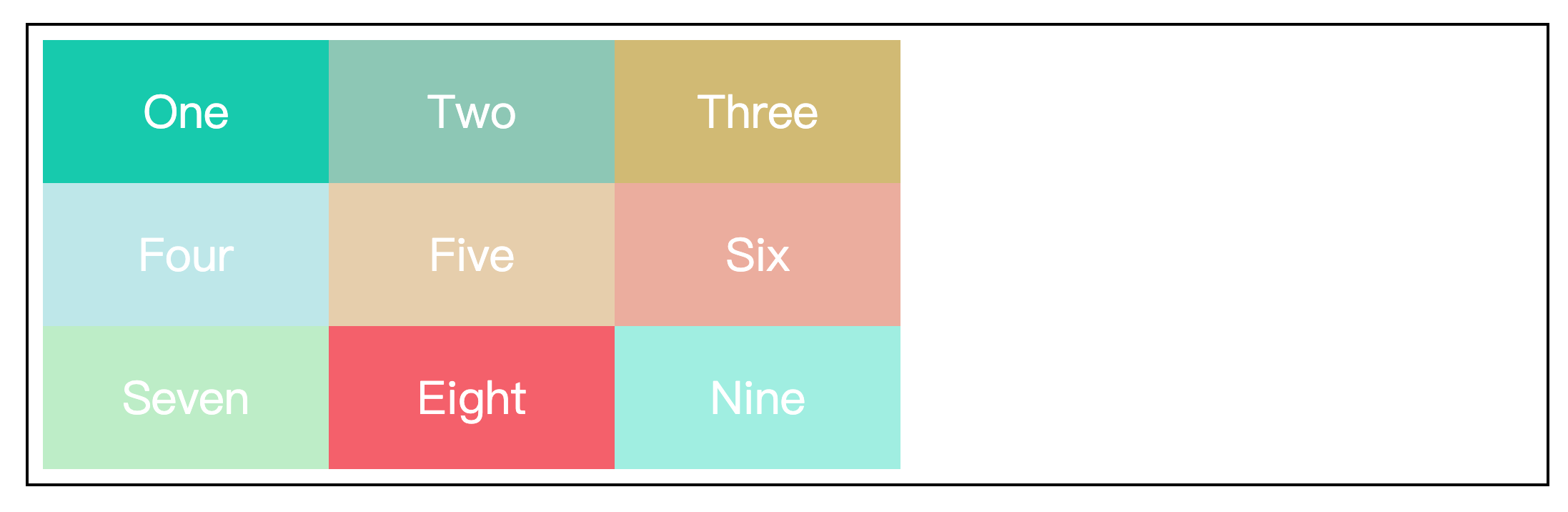
grid-template-columns 属性设置的是网格容器的列宽,grid-template-rows 属性设置的是网格容器的行高。
<div class="wrapper">
  <div class="item one">One</div>
  <div class="item two">Two</div>
  <div class="item three">Three</div>
  <div class="item four">Four</div>
  <div class="item five">Five</div>
  <div class="item six">Six</div>
  <div class="item seven">Seven</div>
  <div class="item eight">Eight</div>
</div>.wrapper {
width: 70%;
height: 300px;
margin: 100px auto;
border: 2px solid black;
padding: 10px;
/* 设置元素为网格容器 */
display: grid;
/* 设置列宽,列数为3,超出的元素会自动换行 */
grid-template-columns: 200px 200px 200px;
/* 设置行高,行数为1,超出的元素将平分剩余容器的高度 */
grid-template-rows: 200px;
}
.item {
display: flex;
justify-content: center;
align-items: center;
font-size: 200%;
color: #fff;
}
.one {
background-color: #19CAAD;
}
.two {
background-color: #8CC7B5;
}
.three {
background-color: #D1BA74;
}
.four {
background-color: #BEE7E9;
}
.five {
background-color: #E6CEAC;
}
.six {
background-color: #ECAD9E;
}
.seven {
background-color: #BEEDC7;
}
.eight {
background-color: #F4606C;
}效果如下:
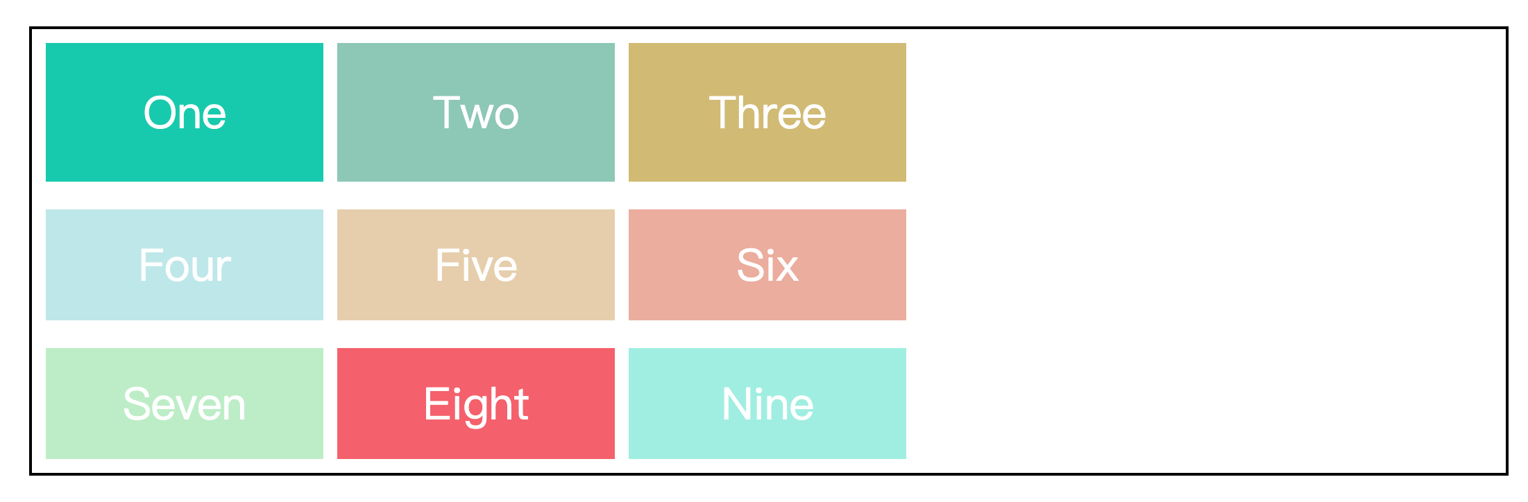
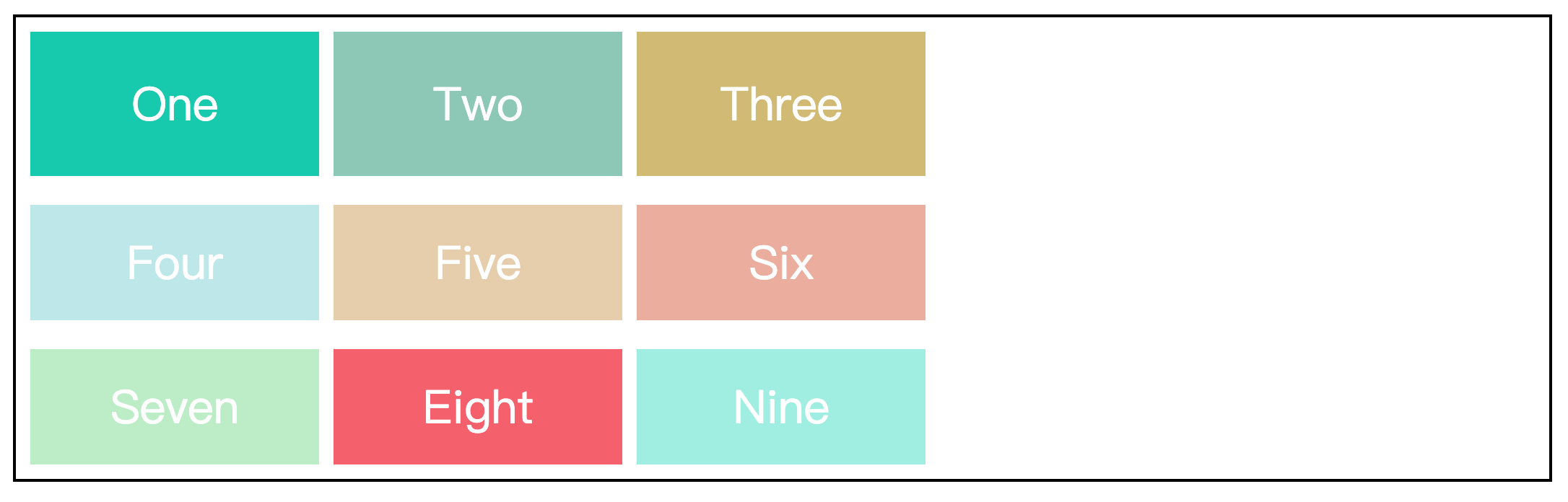
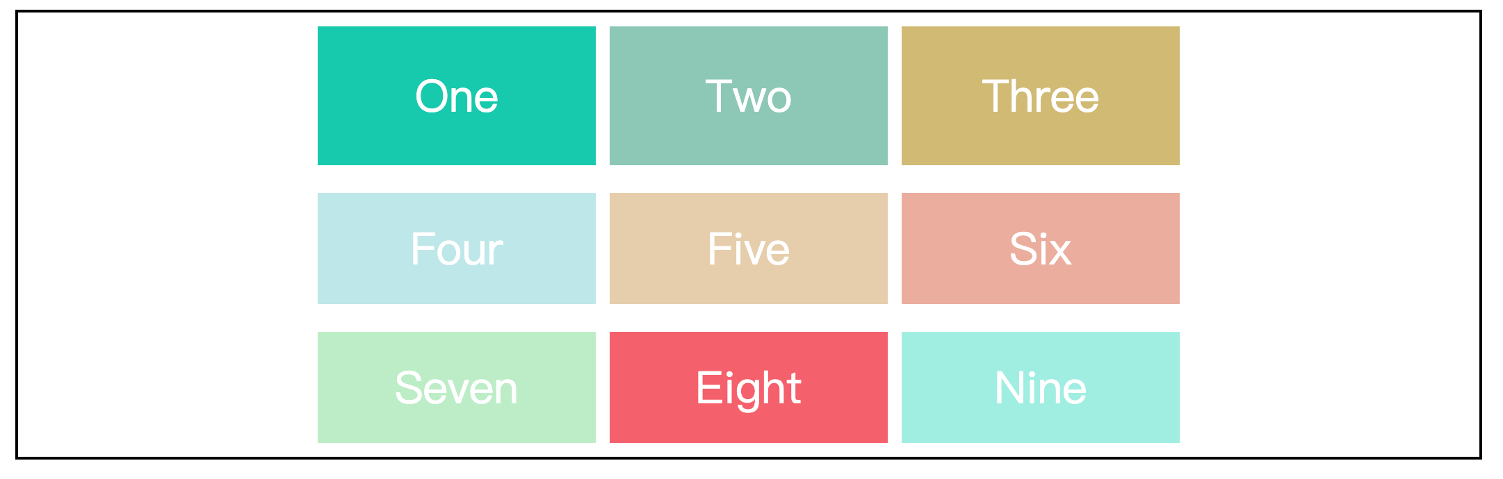
column-gap 属性、row-gap 属性和 gap 属性
column-gap 属性控制列间距,row-gap 属性控制行间距。
gap 属性是这两个属性的简写,gap: <row-gap> <column-gap>
.wrapper {
  width: 70%;
  height: 300px;
  margin: 100px auto;
  border: 2px solid black;
  padding: 10px;

  /* 设置元素为网格容器 */
  display: grid;
  /* 设置列宽,列数为3,超出的元素会自动换行 */
  grid-template-columns: 200px 200px 200px;
  /* 设置行高,行数为1,超出的元素将平分剩余容器的高度 */
  grid-template-rows: 100px;
  /* 设置列间距 */
  /* column-gap: 10px; */
  /* 设置行间距 */
  /* row-gap: 20px; */
  /* 设置行间距20px,列间距10px */
  gap: 20px 10px;
}效果如下:
grid-gap 属性和 gap 属性有什么区别?
grid-gap 属性是 grid 布局特有的属性,而 gap 属性是一个通用属性,适用于任何布局模式,如 grid、flex 和多列布局等。
推荐使用 gap 属性,因为 gap 属性比较通用,在多个布局模式之间切换也更加方便。
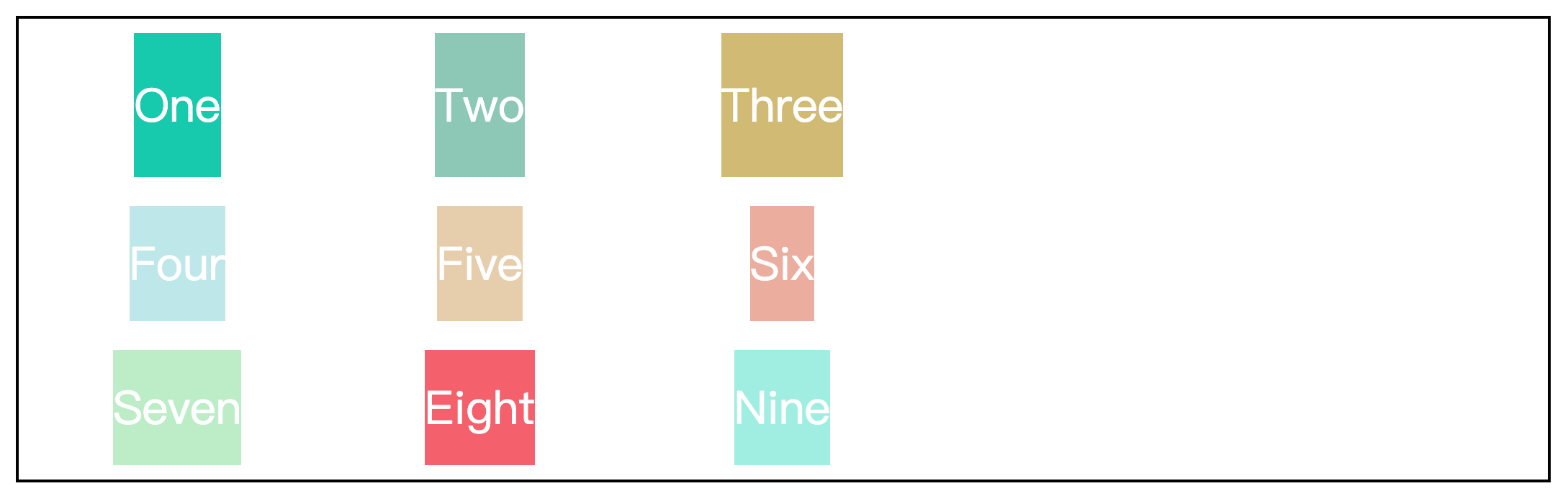
repeat() 函数
repeat() 函数可以简化 grid-template-columns 属性和grid-template-rows 属性的重复值。
该函数有两个参数,第一个参数是重复的列数(或行数),第二个参数是重复值。
.wrapper {
width: 70%;
height: 300px;
margin: 100px auto;
border: 2px solid black;
padding: 10px;
/* 设置元素为网格容器 */
display: grid;
/* 使用repeat()函数简化重复值 */
grid-template-columns: repeat(3, 200px);
grid-template-rows: 100px;
/* 设置行间距20px,列间距10px */
gap: 20px 10px;
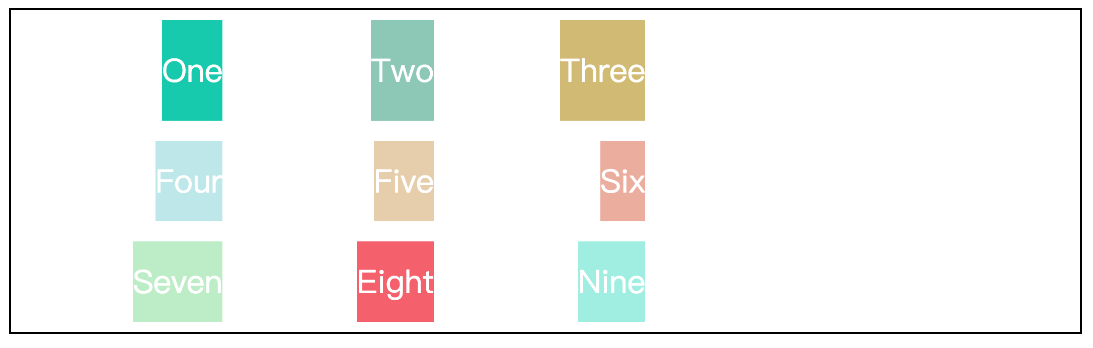
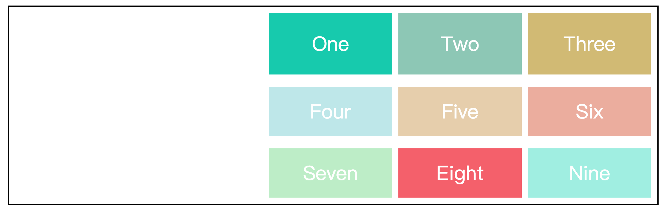
}auto-fill 关键字
auto-fill 关键字表示自动填充,让一行(或一列)尽可能的容纳更多的项目。
.wrapper {
  width: 70%;
  height: 300px;
  margin: 100px auto;
  border: 2px solid black;
  padding: 10px;

  /* 设置元素为网格容器 */
  display: grid;
  /* 使用auto-fill关键字,列数不固定,将根据容器的宽度自动填充 */
  grid-template-columns: repeat(auto-fill, 200px);
  /* 设置行高,行数为1,超出的元素将平分剩余容器的高度 */
  grid-template-rows: 200px;
  /* 设置行间距20px,列间距10px */
  gap: 20px 10px;
}效果如下:

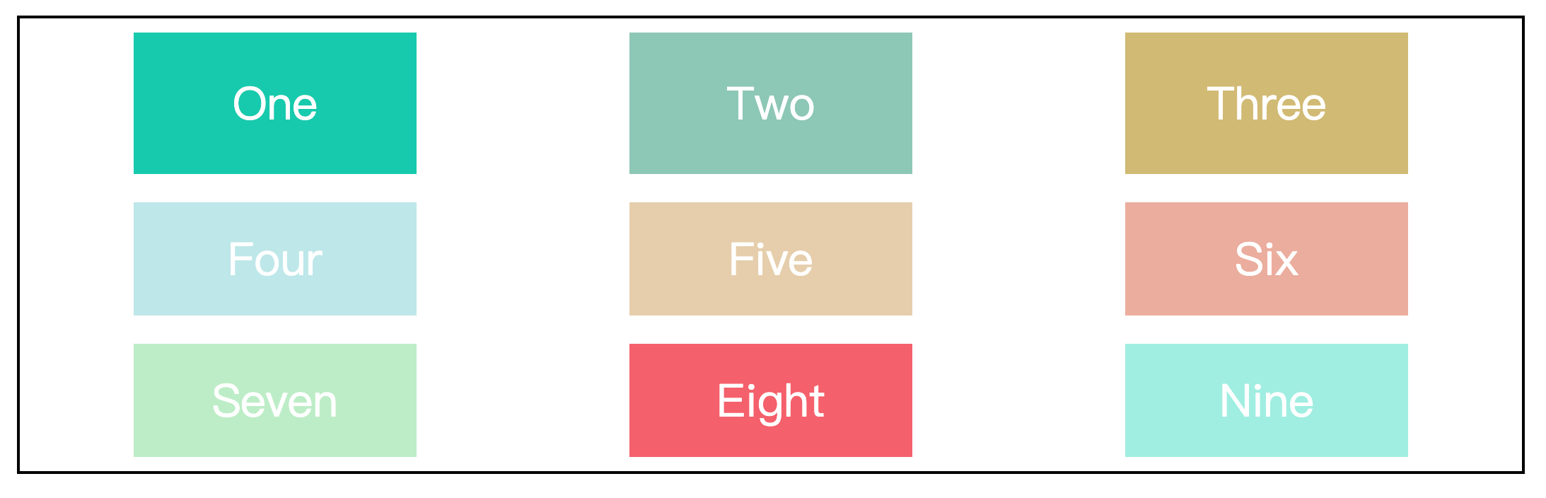
fr 关键字
fr 关键字是 grid 布局中的一种长度单位,表示网格容器中剩余空间的一部分。
一般情况下,1fr表示“剩余空间的100%”,.25fr表示“剩余空间的25%”。当 fr 大于1时,则会重新计算分配比例。
.wrapper {
  width: 70%;
  height: 300px;
  margin: 100px auto;
  border: 2px solid black;
  padding: 10px;

  /* 设置元素为网格容器 */
  display: grid;
  /* 设置第一列的列宽为200px,设置第二第三列均为剩余空间的40% */
  grid-template-columns: 200px repeat(2, .4fr);
  /* 设置行高,行数为1,超出的元素将平分剩余容器的高度 */
  grid-template-rows: 200px;
  /* 设置行间距20px,列间距10px */
  gap: 20px 10px;
}效果如下:

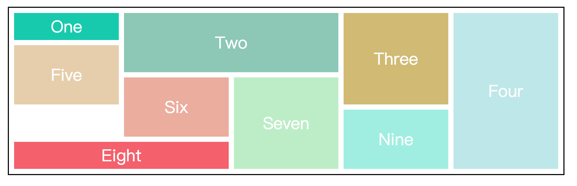
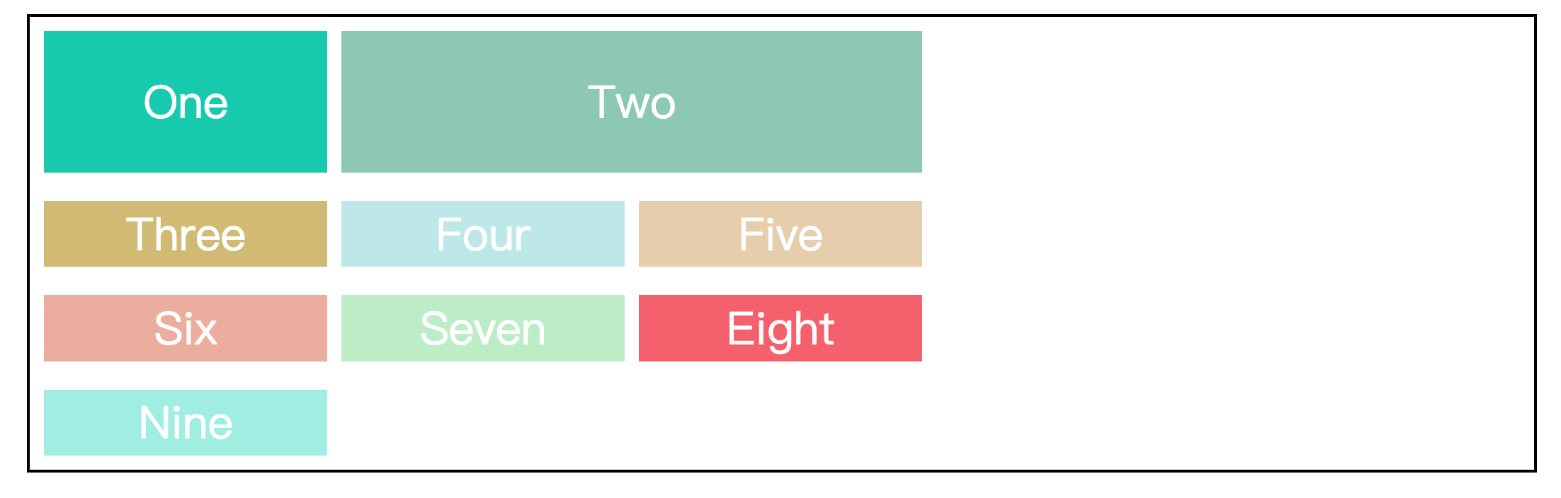
grid-template-area 属性
grid-template-area 属性用于定义区域,一个区域由一个或多个网格组成。
这个属性一般与项目属性中的 grid-area 属性配合使用。
.wrapper {
  width: 70%;
  height: 500px;
  margin: 100px auto;
  border: 2px solid black;
  padding: 10px;

  /* 设置元素为网格容器 */
  display: grid;
  /* 行列间距10px */
  gap: 10px;
  /* 定义区域 */
  grid-template-areas:
    "one   two   two   three four"
    "five  two   two   three four"
    "five  six   seven three four"
    ".     six   seven nine  four"
    "eight eight seven nine  four";
}

.item {
  display: flex;
  justify-content: center;
  align-items: center;
  font-size: 200%;
  color: #fff;
}

.one {
  background-color: #19CAAD;
  grid-area: one;
}

.two {
  background-color: #8CC7B5;
  grid-area: two;
}

.three {
  background-color: #D1BA74;
  grid-area: three;
}

.four {
  background-color: #BEE7E9;
  grid-area: four;
}

.five {
  background-color: #E6CEAC;
  grid-area: five;
}

.six {
  background-color: #ECAD9E;
  grid-area: six;
}

.seven {
  background-color: #BEEDC7;
  grid-area: seven;
}

.eight {
  background-color: #F4606C;
  grid-area: eight;
}

.nine {
  background-color: #A0EEE1;
  grid-area: nine;
}上述定义区域的代码中,.符号表示该单元格没有项目占用,即该单元格为空。
效果如下:
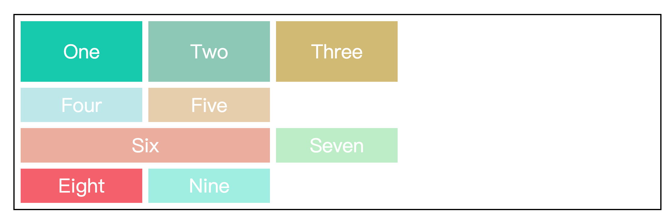
grid-auto-columns 属性和 grid-auto-rows 属性
在介绍这两个属性前,先引入两个概念,显式网格和隐式网格。
显式网格指的是我们在 grid-template-rows 属性和 grid-template-columns 属性中定义的行和列。如果项目的数量超过了我们定义的网格,或者是我们在定义好的网格之外放置来其他项目,那么网格容器会自动创建隐式网格来容纳剩余的项目。
gird-auto-rows 属性和 grid-auto-columns 属性就是用于定义隐式网格的行高和列宽的。
.wrapper {
  width: 70%;
  margin: 100px auto;
  border: 2px solid black;
  padding: 10px;

  /* 设置元素为网格容器 */
  display: grid;
  /* 设置列宽,列数为3,超出的元素会自动换行 */
  grid-template-columns: 200px 200px 200px;
  /* 设置行高,行数为1 */
  grid-template-rows: 100px;
  /* 行列间距为10px */
  gap: 10px;
  /* 超出第一行的元素,将占用50px的行高 */
  grid-auto-rows: 50px;
}效果如下:
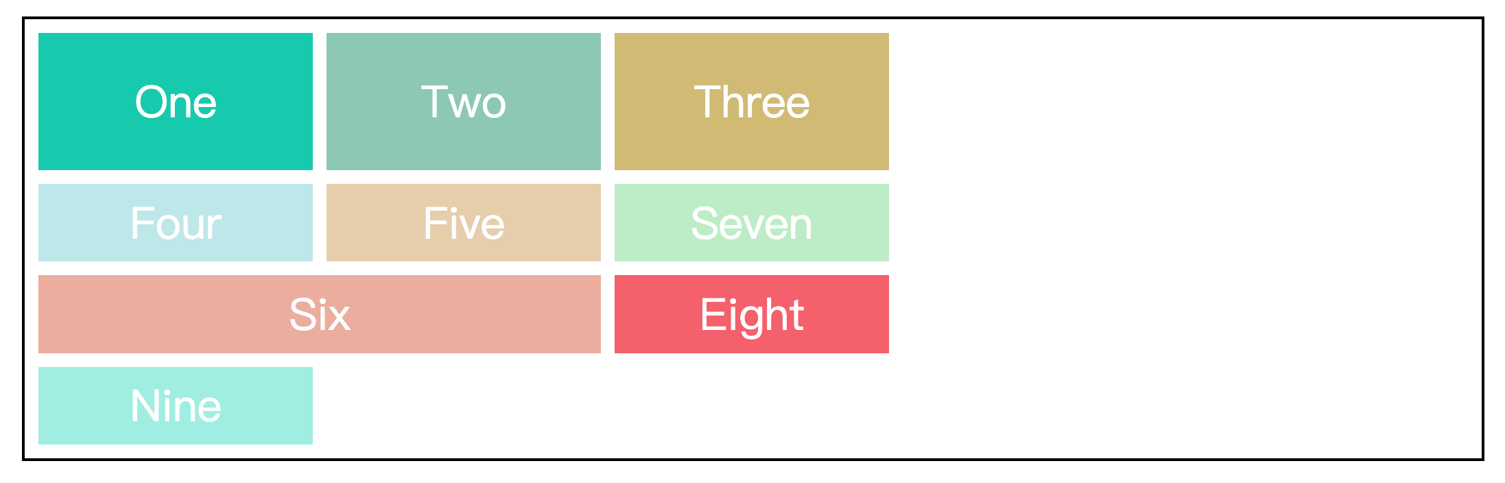
一般情况下,grid-auto-columns 属性相对 grid-auto-rows 属性来说使用的较少,但当我们指定一个项目占据新的一列时,或许会用的上。
.wrapper {
  width: 70%;
  margin: 100px auto;
  border: 2px solid black;
  padding: 10px;

  /* 设置元素为网格容器 */
  display: grid;
  /* 设置列宽,列数为3,超出的元素会自动换行 */
  grid-template-columns: 200px 200px 200px;
  /* 设置行高,行数为1 */
  grid-template-rows: 100px;
  /* 行列间距为10px */
  gap: 10px;
  /* 超出第一行的元素,将占用50px的行高 */
  grid-auto-rows: 50px;
  /* 超出第三列的元素,将占用100px的列宽 */
  grid-auto-columns: 100px;
}

.item {
  display: flex;
  justify-content: center;
  align-items: center;
  font-size: 200%;
  color: #fff;
}

.one {
  background-color: #19CAAD;
}

.two {
  background-color: #8CC7B5;
}

.three {
  background-color: #D1BA74;
}

.four {
  background-color: #BEE7E9;
  /* 指定该项目占据的列的起始位置 */
  grid-column-start: 4;
  /* 指定该项目占据的列的结束位置 */
  grid-column-end: 5;
}

.five {
  background-color: #E6CEAC;
}

.six {
  background-color: #ECAD9E;
}

.seven {
  background-color: #BEEDC7;
}

.eight {
  background-color: #F4606C;
}

.nine {
  background-color: #A0EEE1;
}效果如下:
grid-auto-flow 属性
grid-auto-flow 属性控制着网格的自动布局算法,默认值是row,即先行后列。
.wrapper {
  width: 70%;
  height: 500px;
  margin: 100px auto;
  border: 2px solid black;
  padding: 10px;

  /* 设置元素为网格容器 */
  display: grid;
  /* 设置列宽,列数为3,超出的元素会自动换行 */
  grid-template-columns: 200px 300px 200px;
  /* 行列间距10px */
  gap: 10px;
  /* 设置隐式网格的行高为100px */
  grid-auto-rows: 100px;
  /* 默认先行后列 */
  grid-auto-flow: row;
}

.item {
  display: flex;
  justify-content: center;
  align-items: center;
  font-size: 200%;
  color: #fff;
}

.one {
  background-color: #19CAAD;
}

.two {
  background-color: #8CC7B5;
}

.three {
  background-color: #D1BA74;
}

.four {
  background-color: #BEE7E9;
}

.five {
  background-color: #E6CEAC;
}

.six {
  background-color: #ECAD9E;
  grid-column-start: 1;
  grid-column-end: 3;
}

.seven {
  background-color: #BEEDC7;
}

.eight {
  background-color: #F4606C;
}

.nine {
  background-color: #A0EEE1;
}效果如下:
我们可以看到第二行的最后有一块空白,这是因为第六个项目的长度大于空白的长度,因此第六个项目被挤到了下一行。在实际的场景中,我们也许需要尽可能的填满网格,这个时候我们可以将值设成row dense,表示网格布局按先行后列的布局算法自动排列,并且当后面有较小的元素时,会试图去填满前面的空白,当然这也会打乱项目原来的顺序。
.wrapper {
  width: 70%;
  height: 500px;
  margin: 100px auto;
  border: 2px solid black;
  padding: 10px;

  /* 设置元素为网格容器 */
  display: grid;
  /* 设置列宽,列数为3,超出的元素会自动换行 */
  grid-template-columns: 200px 300px 200px;
  /* 行列间距10px */
  gap: 10px;
  /* 设置隐式网格的行高为100px */
  grid-auto-rows: 100px;
  /* 先行后列,尽可能填满网格 */
  grid-auto-flow: row dense;
}效果如下:
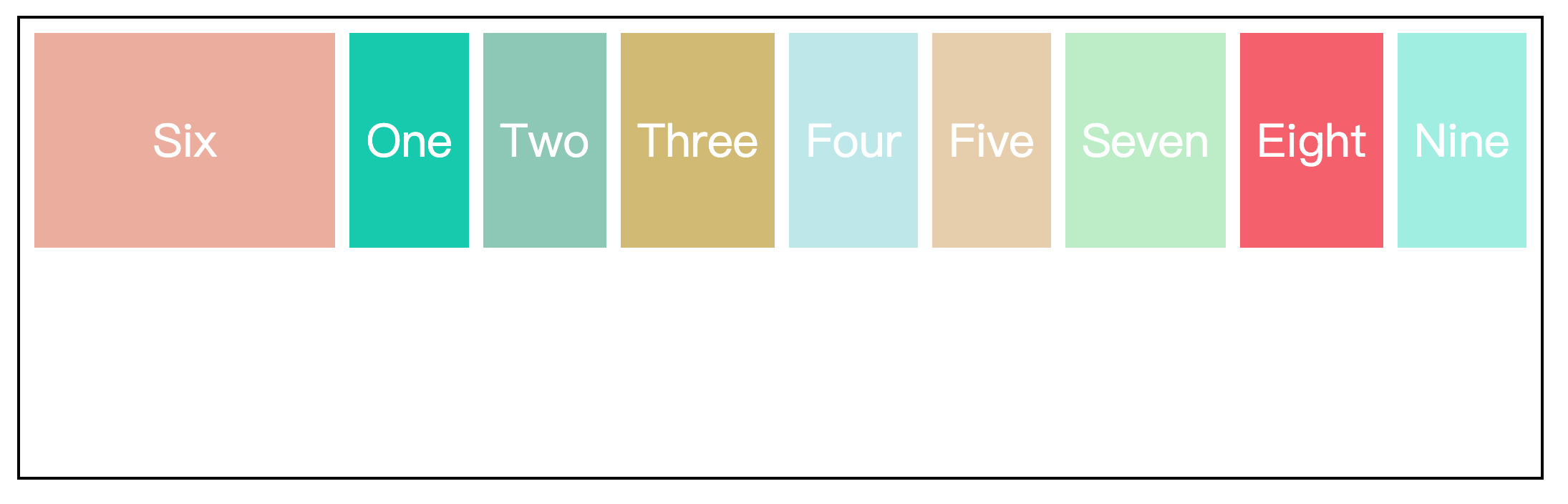
同样的,也可以将值设成column,即先列后行。
.wrapper {
  width: 70%;
  height: 300px;
  margin: 100px auto;
  border: 2px solid black;
  padding: 10px;

  /* 设置元素为网格容器 */
  display: grid;
  /* 设置行高100px,行数为2 */
  grid-template-rows: 100px 100px;
  /* 设置隐式网格的列宽为150px */
  grid-auto-columns: 150px;
  /* 行列间距10px */
  gap: 10px;
  /* 先列后行 */
  grid-auto-flow: column;
}效果如下:
justify-items 属性和 align-items 属性
justify-items 属性控制网格中内容的水平位置,align-items 属性控制网格中内容的垂直位置。
这两个属性的取值相同:
justify-items: start | center | end | stretch;
align-items: start | center | end | stretch;以 justify-items 属性为例:
.wrapper {
  width: 70%;
  height: 300px;
  margin: 100px auto;
  border: 2px solid black;
  padding: 10px;

  /* 设置元素为网格容器 */
  display: grid;
  /* 使用repeat()函数简化重复值 */
  grid-template-columns: repeat(3, 200px);
  /* 设置行高,行数为1,超出的元素将平分剩余容器的高度 */
  grid-template-rows: 100px;
  /* 行间距20px,列间距10px */
  gap: 20px 10px;
  justify-items: start;
}效果如下:
- start:对齐网格起始位置边缘
- center:网格内容居中
- end:对齐网格结束位置边缘
- stretch:拉伸,占满网格的整个宽度(默认值)
justify-content 属性和 align-content 属性
justify-content 属性控制整个内容区域在 grid 容器中的水平位置,align-content 属性控制整个内容区域在 grid 容器中的垂直位置。
这两个属性的取值相同:
justify-content: start | center | end | stretch | space-around | space-between | space-evenly;
align-content: start | center | end | stretch | space-around | space-between | space-evenly;以 justify-content 属性为例:
.wrapper {
  width: 70%;
  height: 300px;
  margin: 100px auto;
  border: 2px solid black;
  padding: 10px;

  /* 设置元素为网格容器 */
  display: grid;
  /* 使用repeat()函数简化重复值 */
  grid-template-columns: repeat(3, 200px);
  /* 设置行高,行数为1,超出的元素将平分剩余容器的高度 */
  grid-template-rows: 100px;
  justify-content: start;
}效果如下:
- start:内容区域对齐容器的起始位置边缘
- center:内容区域在容器的居中位置
- end:内容区域对齐容器的结束位置边缘
- space-around:内容区域与容器两边的间隔相等,并且这个间隔是项目之间原间隔的二分之一
- space-between:内容区域与容器两边没有间隔,项目之间原间隔相等

- space-evenly:内容区域与容器两边的间隔,和项目之间的原间隔相等
注意
项目之间的间隔会受 gap 属性设置的行高或列宽影响。
项目的总间隔 = 属性值(space-around、space-between、space-evenly)分配的原间隔 + gap属性的行高或列宽
项目属性
grid-area 属性
grid-area 属性指定项目被放在哪个区域,上面的 grid-template-area 属性已经介绍过,不在赘述。
grid-column 属性和 grid-row 属性
grid-column 属性控制的是网格列的起始位置和结束位置,它是 grid-column-start 属性和 grid-column-end 属性的缩写。
如果指定了两个值,那么/符号前的值就被指定为 grid-column-start,/符号后的值就被指定为 grid-column-end。
grid-row 属性同理。
下面以 grid-column 属性为例:
.wrapper {
  width: 70%;
  height: 300px;
  margin: 100px auto;
  border: 2px solid black;
  padding: 10px;

  /* 设置元素为网格容器 */
  display: grid;
  /* 使用repeat()函数简化重复值 */
  grid-template-columns: repeat(3, 200px);
  /* 设置行高,行数为1,超出的元素将平分剩余容器的高度 */
  grid-template-rows: 100px;
  /* 行列间距10px */
  gap: 10px;
}

.two {
  background-color: #8CC7B5;
  /* two元素的列从第二列开始到第四列结束 */
  grid-column: 2 / 4;
}效果如下:
也可以通过 span 关键字指定网格列的跨度,达到一样的效果。
.two {
  background-color: #8CC7B5;
  /* 指定two元素的列跨度占两列 */
  grid-column: span 2;
}grid布局与flex布局的区别
grid 布局是二维布局,可以控制多行多列。而 flex 布局是一维布局,它只能控制一行或者一列。